Notes Week 1
Websites = HTML + CSS + JavaScript
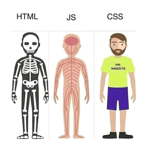
A good analogy for thinking about HTML and CSS is that they work together like a human body. All of these work together to create a fully-fledged website.
- A body has a skeleton, which accounts for the rough structure of how everything fits together. This is like the HTML.
- A body has clothes on it, which make the body presentable to the outside world. This is like the CSS.
- A body has blood, organs, and muscles under its skin, which means that it can move around. This is like the JavaScript.
Nesting
When an element is contained by another element, we say that it is nested inside of the containing element.
<body>
  <p>A paragraph inside a body element.</p>
</body>
Most elements contain something else (either text or other elements). These are referred to as container elements. Some elements are self-closing, and can’t contain other elements. These are called stand-alone elements (e.g. <img /> and <br>).
It’s important to keep the right order with opening/closing tags when they’re nested. The element that opens first closes last. We can use indents to keep track of this.
CSS Rules
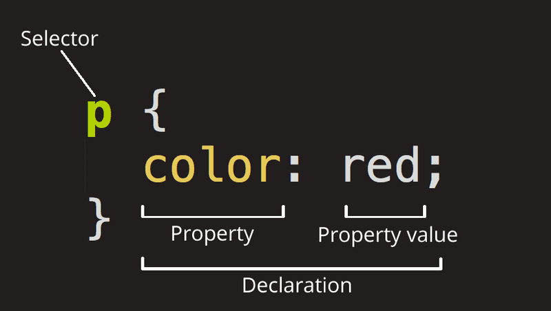
An individual unit of CSS is called a rule. A rule comprises a selector, which grabs elements on the page, and a set of declarations, which set CSS properties with values.
Including CSS in HTML
To add CSS to our HTML file, we have 3 options.
Inline CSS involves adding CSS declarations with the style attribute of HTML elements.
<p style="color:red;font-size:24px">Embedded CSS involves writing code in the <head> section of our HTML file inside of <script> tags.
<head>
  <style type="text/css">
    p {
      color: red;
      font-size: 24px;
    }
  </style>
</head>
External CSS involves writing our CSS in a separate styles.css file, and then using a <link> tag to include it in the <head> section of our HTML file.
<head>
  <link rel="stylesheet" type="text/css" href="styles.css">
</head>
Where possible, it’s always best to use external CSS, since this keeps code tidy.
Selectors
The 3 most important selectors select HTML elements based on tag name, ID and class. IDs and classes are both attributes that we can set within our HTML.
This code grabs all HTML elements with the tag name of p:
p {
  color: white;
  background-color: black;
}
This code grabs all HTML elements with the ID of first:
#first {
  color: white;
  background-color: black;
}
This code grabs all HTML elements with the class of outer:
.outer {
  color: white;
  background-color: black;
}
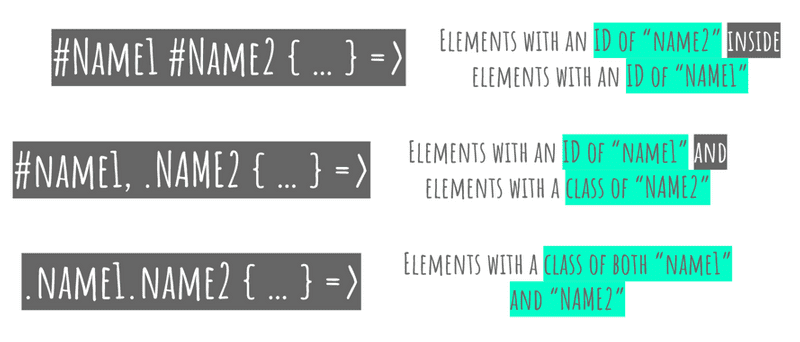
There are a few other handy CSS selectors, which you don’t necessarily need to know:
Properties: Color
We can use CSS declarations like this to color the background and text of our elements:
p {
  color: white;
  background-color: black;
}
Remember that the color property always refers to the text color, as this is easy to mix up. We can use the name of a color (e.g. red, blue, white), an RGB value (e.g. rgb(255,0,0)), or a HEX value (e.g. #FF0000).
The CSS box model
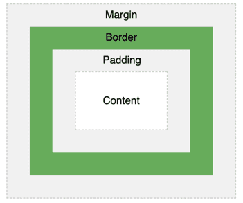
To position elements with CSS, we can treat every type of HTML element as existing inside a box. This box can have a width, a height, some inner padding, a border around the outside, and a margin, which acts as a buffer against other elements.
#my-box {
  width: 200px;
  height: 200px;
  padding: 10px; /* 10px all the way around */
  border: 2px solid blue; /* thickness / style / color */
  margin: 10px 15px 5px 0px; /* top / right / bottom / left */
}
Responsive Design & CSS Libraries
We want to make sure that our websites look good on all screen sizes (e.g. a phone, a computer, and a TV). We could handle this with some complex CSS rules, but it’s much easier to use a CSS component library that handles this for us.
The most famous CSS library, and one of the easiest to set up with HTML, is Bootstrap. This has a grid system, which separates the page into 12 equally spaced columns, and allows us to make our elements different sizes depending on what size screen our site is viewed on.


